This post explains how to estimate your admission chances using scattergrams. A scattergram is an X-Y plot that shows past admission decisions to a particular college. This post takes you through a case study of how to use scattergrams to classify colleges into one of the five admission likelihood categories.

A scattergram shows GPA on one axis and test scores on the other. Color-coded symbols indicate the admission status of past applicants. The exact colors and symbols can vary, but generally green means admitted, and red means rejected. A third color is used to indicate waitlisted, in this case a purple circle that is filled in.
Case Study
Let’s go through a case study for a student considering colleges with varying levels of selectivity. She has a weighted GPA of 4.54 and an SAT score of 1470. Through her school’s guidance office, she has access to scattergrams showing how past applicants from her high school did with admissions at each college. You should use scattergrams from your school whenever possible, for reasons discussed later.
High Reach
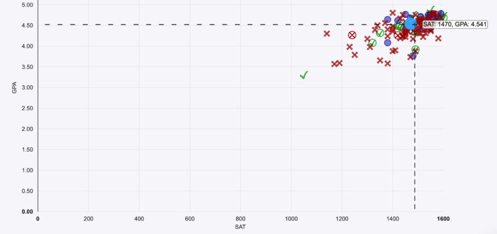
She would love to join Yale, which has the scattergram shown at the beginning of this article. How likely is she to be admitted? Given no other information, we have to say very unlikely. That’s because her GPA/SAT combination, which is indicated with an open blue circle, is surrounded by a sea of red Xs, meaning that nobody like her was recently admitted. Based upon this information, she should classify Yale as a High Reach, a college with less than a 10% admit rate for students like her.
You might be wondering about the green checkmark with a much lower SAT score. That is likely a hooked student, perhaps a recruited athlete, who faces lower academic criteria for admission. She should check with her school counselor to verify, and unless she is also a hooked student, she should ignore that data point in her analysis.
Low Reach
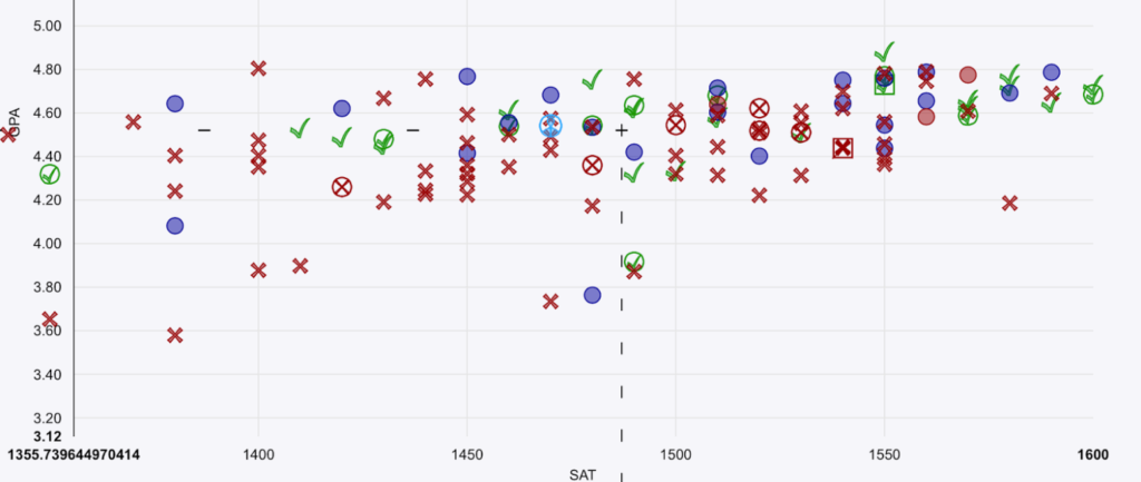
We will consider a few more examples. First up is Cornell. Let’s start with the full graph, which is too crowded in the upper right corner to tell us much.

Zooming in reveals much more useful information. We can see that although her blue circle is mostly surrounded by red Xs, there are a handful of green checkmarks in all directions. Once she verifies from the counselor that these are not all hooked students, she can safely classify Cornell as a Low Reach, a college with an admit rate for students like her somewhere between 10%-25%.

High Match
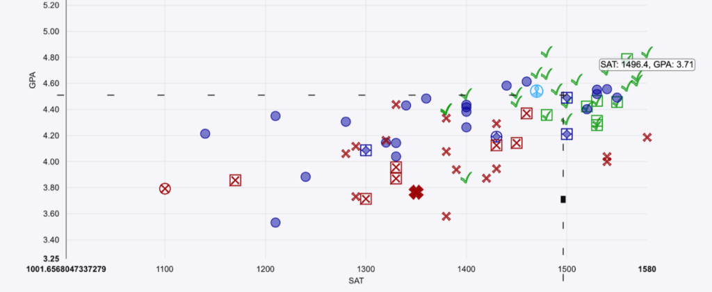
A High Match college has an admit rate for students like her between 25% – 50%. NYU fits the bill here. While there are few outright rejections around her blue circle, there are a large number of waitlists so the admit rate is relatively low.

Low Match
A Low Match college has an admit rate for students like her between 50% – 75%. An example of a college fitting that criteria is Boston College, as over half of the decisions around her are admittances.

Likely
Finally, let’s look at Santa Clara University. Here the blue circle is among mostly green checkmarks, easily more than the 75% cutoff required to make admission there Likely.

Limitations of Scattergrams
Scattergrams are very useful for a first-cut analysis, but they have some limitations.
- If your high school does not weight classes, then the scatterplot does not adjust for rigor. For the most selective schools, you need to be in range GPA-wise and also take a rigorous courseload.
- Hooked students may make admission appear more likely than it actually is. Your school counselor should be able to identify the datapoints that are hooked.
- The plot shows both students that applied early and during regular decision. Some colleges have much higher admit rates for early applicants than they do for regular applicants.
- The scattergram is for colleges as a whole, and some departments may have more rigorous requirements. This is often true of CS and engineering departments, as well as undergraduates applying to a well known business school (like Wharton, Stern, Ross, or Haas). A good approach here is to assume that for you, admission is one level harder than the scattergram shows. For example, NYU looks like a High Match above, but for Stern would be better classified as a Low Reach.
- At this time when many colleges are test-optional, the SAT or ACT score has less importance than it used to. For those colleges, you should pay more attention to the GPA values that indicate likelihood of admission.
Use Your School’s Data Whenever Possible
It’s always best to use scattergrams generated from your school’s past applicants, rather than from a national source like Niche.com. There are a few reasons for this.
- Grading scales vary between schools. Some schools favor weighted GPA, whereas others only do unweighted. Some schools may have rigorous grading where very few get all As, and others may have dozens of students with a 4.0, so you cannot directly GPA across high schools.
- Each high school can have its own reputation with a college. If multiple students from your high school head to NYU each year, then NYU may like your school, giving it a higher admit rate than the national average.
- For public universities, admit rates vary significantly depending upon whether you are in-state or out-of-state. Applications from your high school look at each college in a consistent way.
There are only two good reasons to use a scattergram generated from national data. The first is that your high school cannot generate scattergrams. The second is that too few students are applying from your school to generate a useful graph. In either case, a national scattergram is better than nothing, but keep the above caveats in mind.


